

SSDA Data Visualization Challenge Summer 2019
Thu, June 6, 2019 12:00 AM - Sun, August 4, 2019 11:59 PM at Nisbet Building, Suite 320, Michigan State University
We gladly to invite EVERYONE to join us this summer to have fun @ SSDA Data Visualization Challenge! Please VOTE online NOW! The online voting is open to public from today to Sunday, August 4, 2019. Please contact ssda@msu.edu with any questions or comments. Thank you for your support to SSDA events!
Who: EVERYONE is eligible to vote online!How: Clinck HERE to vote by Sunday, August 4, 2019 (11:59 P.M. EST)
Submissions: Please see below:
A. Attentional Capture Effect
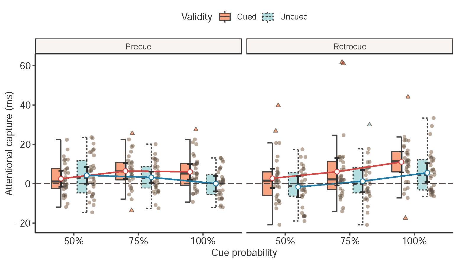
This plot illustrated the attentional capture effect (measured in milliseconds) in the visual search task for factors Cue type, Cue probability, and Cue validity. In this graph, the estimated marginal means (colored circles) and error bars from linear mixed-effects model fitting were plotted in the foreground, and raw data (half boxplot and half semitransparent individual points) was plotted in the background. The outliers (more than upper limit or lesser than the lower limit of the boxplots) for each group were highlighted using the triangles with colors. This plot summarized the model results and allowed readers to inspect individual results.
B. China Population Migration in 2010
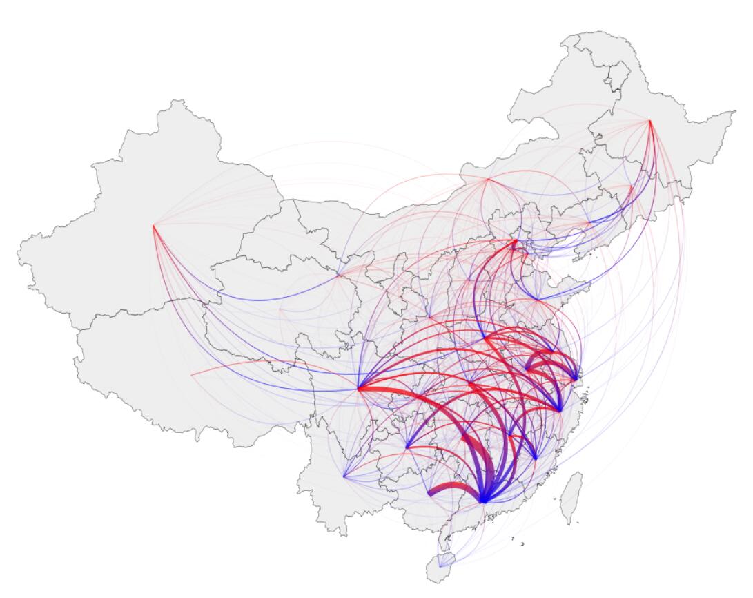
This population migration map revealed a trend that population tended to migrate from the north to south, and from midland to coastal regions (red end stands for emigration, while blue end stands for immigration. The width of the arcs represents the relative amount of migrant). This is partly because the booming socio-economic development in the south/coast of China in recent decades, providing more job opportunities in these regions.
C. Domain Adaptive Mesh Refinement
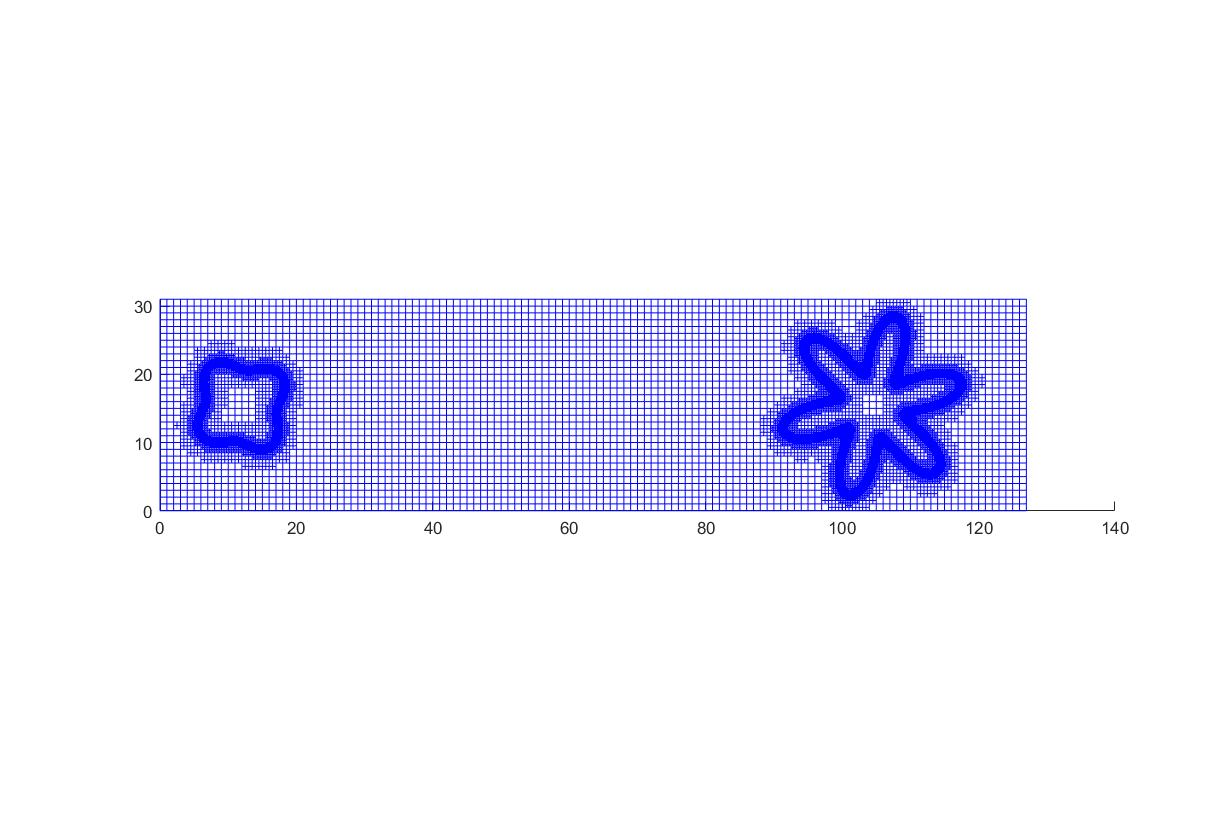
This figure shows how we discretize the electrolyte 2-D domain and the boundary with electrodes. The quadtree is used to break up one big grid into four small girds equally as it is approaching the boundaries. The reason for doing adaptive mesh refinement is that the double layer is very thick and stays very close to the boundaries of electrodes. More spatial details are needed for computational accuracy on the boundaries but not needed in the bulk to save CPU time and resources. The shape on the left-hand side represents anode and the one on the right-hand side represents cathode.
D. Evolution of Global Virtual Material Flows
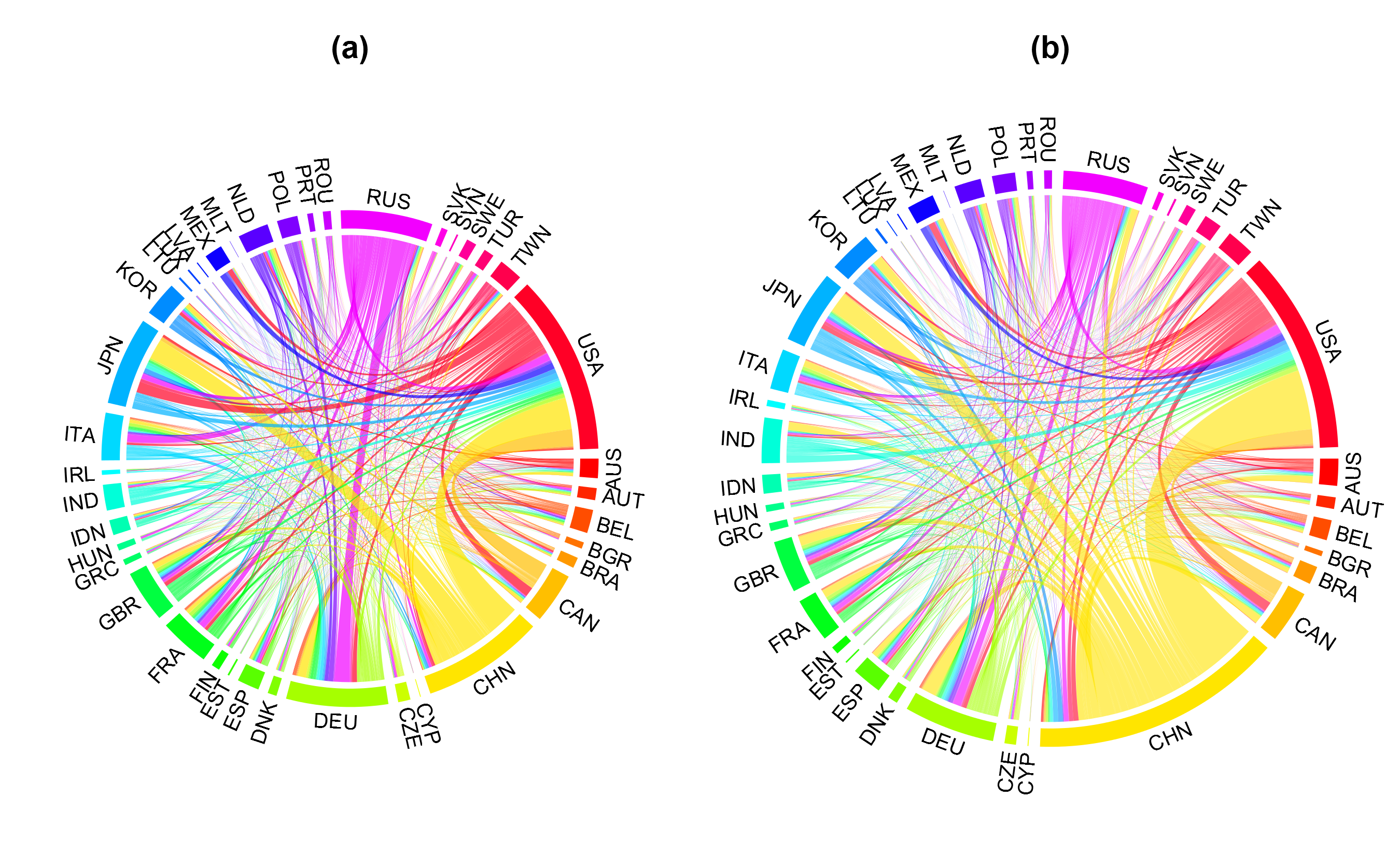
Transfer of virtual CO2 (carbon dioxide embedded in global goods trade) between individual countries (a: in 1995; b: in 2008). The overall size of each circle stands for the total flow. In this case, the total CO2 flow increased from 1995 to 2008. The arc length of an outer circle indicates the sum of exports and imports in each country – in both years, the USA (in red) and China (CHN, in yellow) were the top trading countries in CO2 flow networks. Ribbon colors suggest the export from certain countries. Note: This figure and related results have been published in the Science of the Total Environment.
E. Land-use Change over Three Time Periods
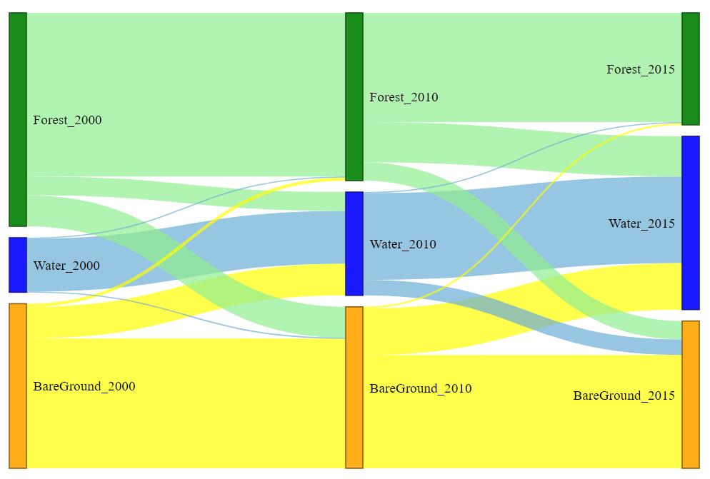
The figure shows the land-use change process within a watershed over three time periods (before, during and after a dam construction). It clearly illustrated that the dam construction led to deforestation and water body increase in the region.
F. Li-ion Concentration Distribution around Anode
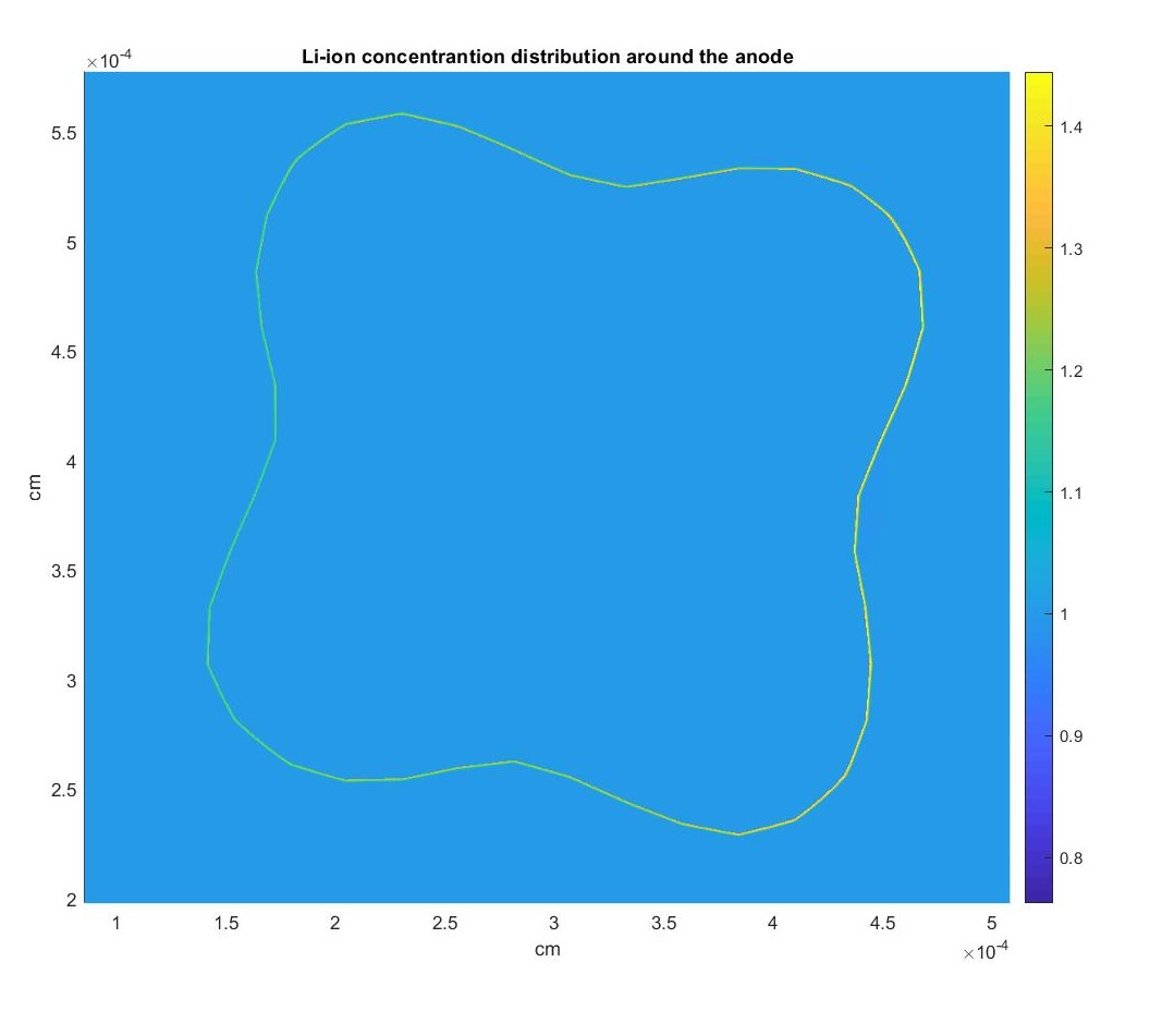
The figure is zoomed to show the lithium-ion concentration distribution around the anode side and using color to represent concentration difference on a 2-D plane. It’s easy for us to see how thick the double layer is compared to the previous figure. Theoretically, the double layer is only several nanometers thick and it will require billions of gird points if we do uniform mesh. It also shows that the concentration of lithium-ion is slightly higher on the side close to the cathode than the side away from the cathode.
G. Li-ion Concentration Distribution in the Electrolyte
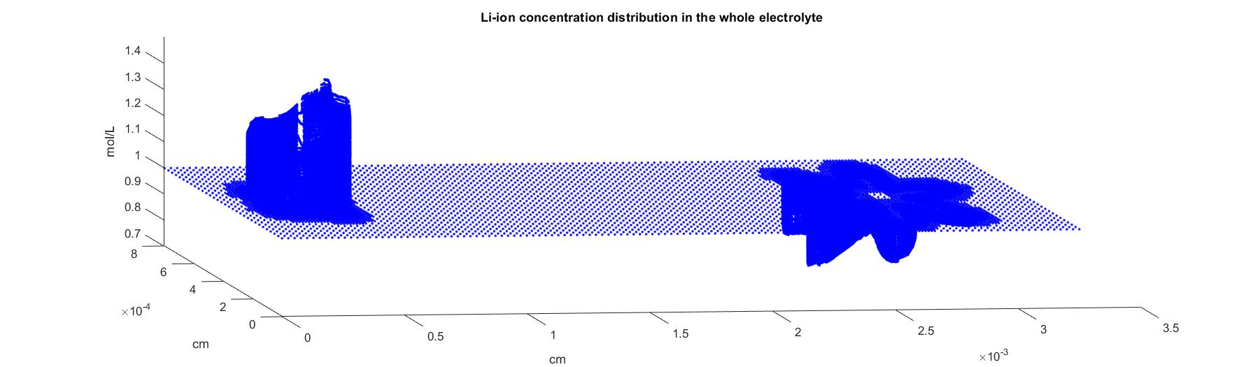
This figure is the Li-ion concentration distribution when the cathode is positively charged and the anode is negatively charged. The x-y plane is our electrolyte 2-D domain, the value on z-axis represents the concentration. It takes only 0.1 milliseconds to reach steady-state physically, but the simulation takes several days to converge. The graph shows that the concentration of lithium-ion has a peak increase surrounding the anode electrode and a valley drop surrounding the cathode electrode.
H. Polarization in the US Senate
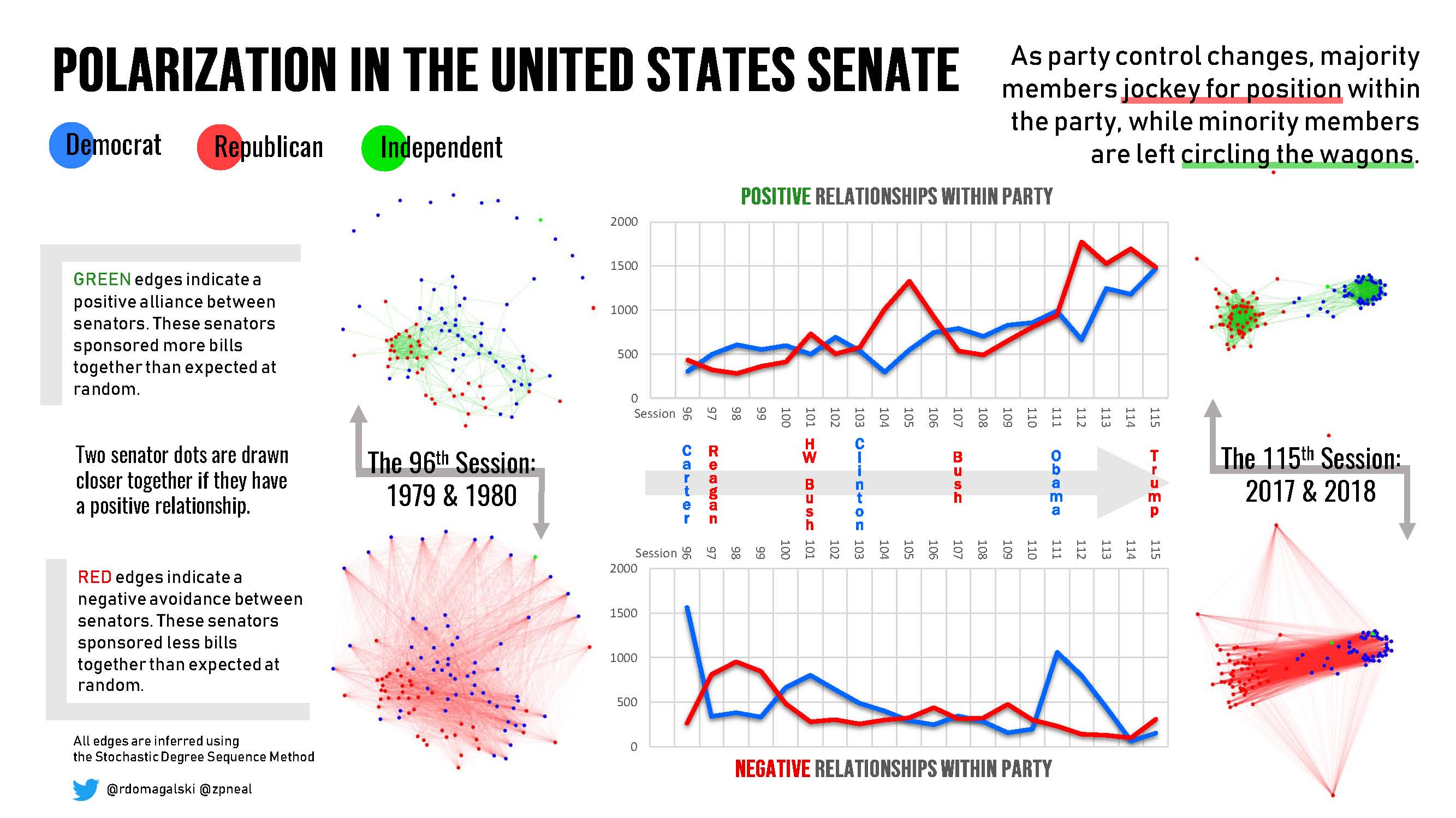
As party control changes, majority members jockey for position within the party, while minority members are left circling the wagons. In the network images on each side of the graphs, green edges indicate a positive alliance between senators. These senators sponsored more bills together than expected at random. Two senator dots are drawn closer together if they have a positive relationship. Red edges indicate a negative avoidance between senators. These senators sponsored less bills together than expected at random. The relationships between senators have been inferred using the Stochastic Degree Sequence Method. We can see that from the 96th session of the Senate to the 115th session of the Senate, polarization has increased.
I. Predicted Probabilities of People Willing to Use Autonomous Transport Service
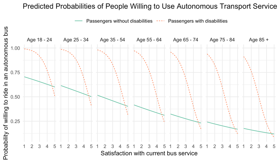
The figure is a visualization of predicted probabilities of people willing to use autonomous transport service calculated by a multivariable logistic regression model. As shown in the figure, the more satisfied a person is with current bus service, the less likely he or she would like to ride in an autonomous bus. Similarly, the older a person is, the less likely he or she would like to ride in an autonomous bus. In addition, depending on whether a person has accommodation needs, satisfaction does not have the same effect on willingness to ride. For people without any disabilities, an increase in satisfaction level from the lowest (1) to the highest (5) is associated with a decrease in probability of those willing to ride by about 25%; while for people who have accommodation needs, an increase in satisfaction level from the lowest to the highest is associated with a decrease in probability of people willing to ride by 50%-75%, which also varies by age – 50% for people from 18 to 24 years old, and 75% for people 85 years and over.
J. Research-Practice Gap Helix
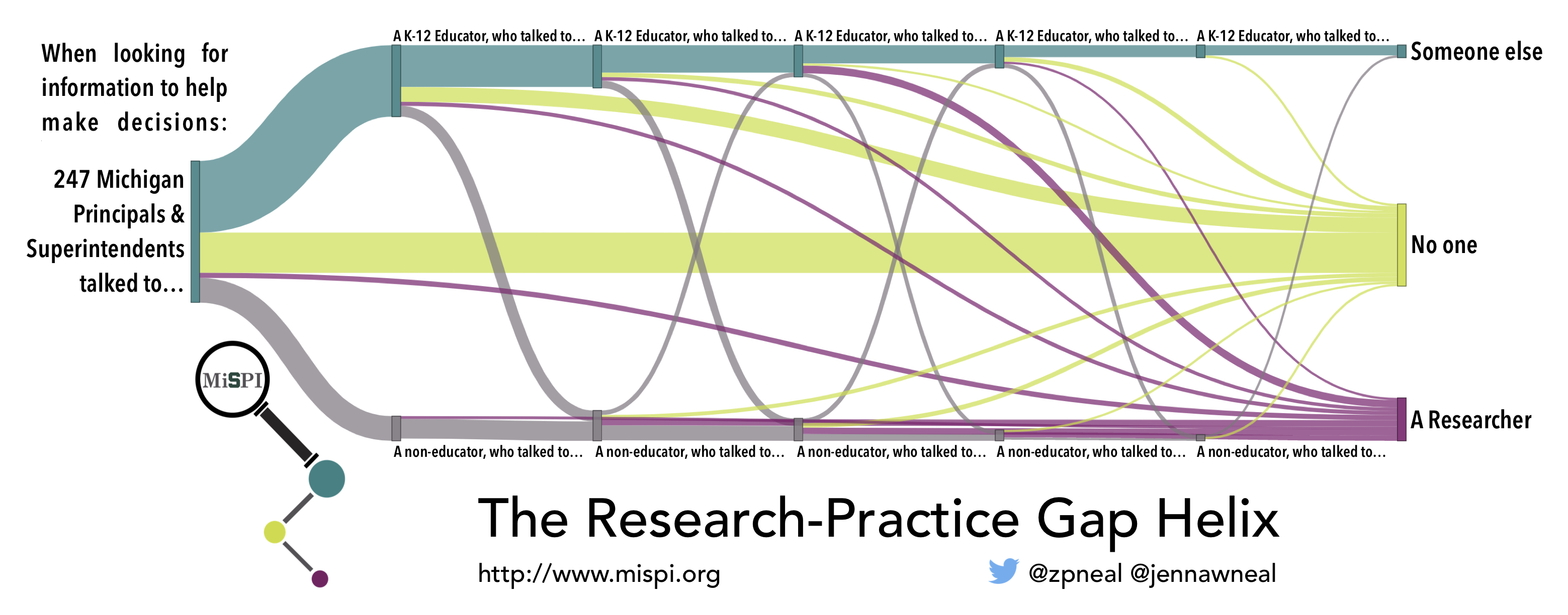
School principals and superintendents often make decisions about programs and practices to adopt in their schools, and sometimes seek information from others to guide their decisions. This plot traces the source of the information sought by a random sample of 247 principals and superintendents in Michigan public schools. Most educators seek information from other educators, but this often ultimately leads them to a dead end. Relatively few educators seek information from non-educators, but when they do, this often puts them in contact with a researcher and high-quality research evidence to guide their decision.
K. Scopus Mapping
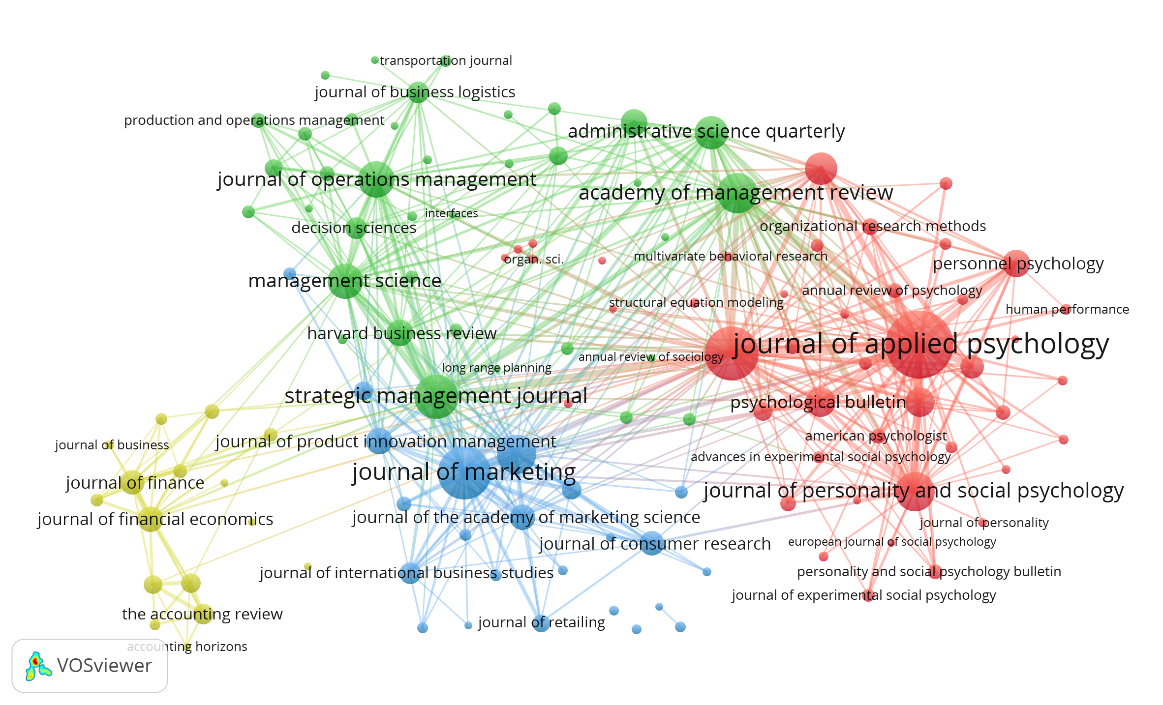
This visualization represents the journals most frequently cited by MSU Broad faculty over the last ten years. The larger the journal bubble, the larger the number of cited works from that journal. In general, the smaller the distance between two journals, the higher the relatedness of the journals, as measured by cited publications. Colors indicate clusters of strongly related journal disciplines (I.e. Management, Marketing).
L. Waves of Polarization
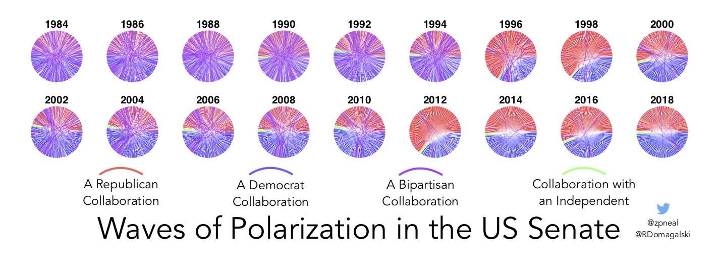
Each circle illustrates the pattern of collaborations among US Senators in a session of Congress, where collaborations have been inferred from bill co-sponsorship data using the stochastic degree sequence model. A collaboration between two Republicans is red, a collaboration between to Democrats is blue, a bipartisan collaboration between a Republican and a Democrat is purple, and a collaboration with an Independent is green. The Senate was highly bipartisan in the 1980s and early 1990s, became polarized in the late 1990s, returned to bipartisanship in the early 2000s, and since 2012 has been highly polarized.
M. #PhDLife: Year One
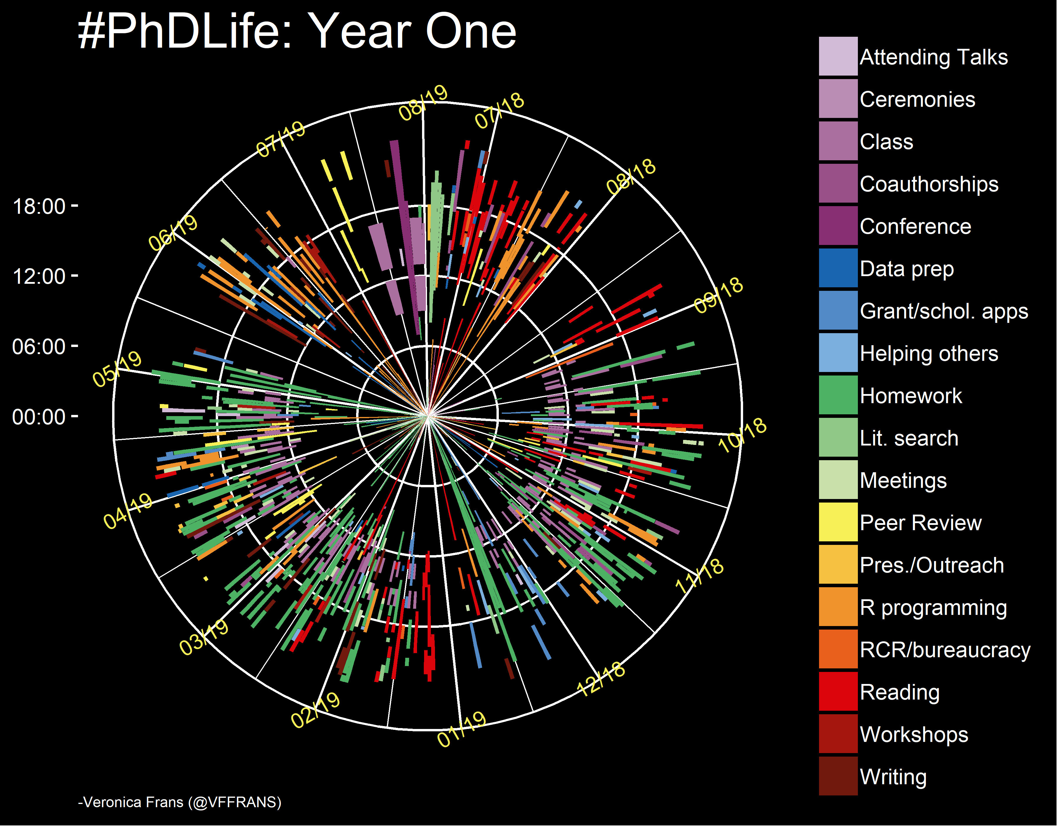
The road to becoming a data analyst in the sciences and social sciences is a long one. But how long is it, actually? Since the start of my PhD in Summer 2018, I recorded all of my time spent on my studies as a PhD student. I used Jiffy Timetracker (phone app) each day, exported the times, and calculated the summaries in R. This circular bar plot summarizes my daily activities into 18 main tasks, with the date and time of each activity. They represent a total of 2325 hours. Most of my time was spent on homework (697 hrs), class attendance (296 hrs), R programming (311 hrs) and reading (278 hrs). Each ring within the circle represents the ticks of the y-axis (left) for time within a 24-hr period. The larger ticks of the x-axis are labeled as 'month/year'. The main conclusion for Year One: this aspiring data analyst is definitely a night owl!